IT’S FINALLY HERE!! I have been waiting to share our dining room and living room design with you for so long and excited to finally show you the big reveal. My talented friend Anne helped to bring our vision to life. Anne and I collaborated on my master bedroom redesign and after the success of that project, we wanted to move through the house and start working through the space.
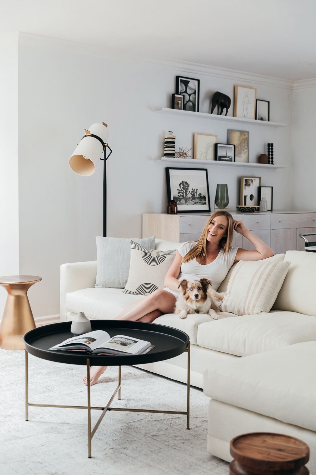
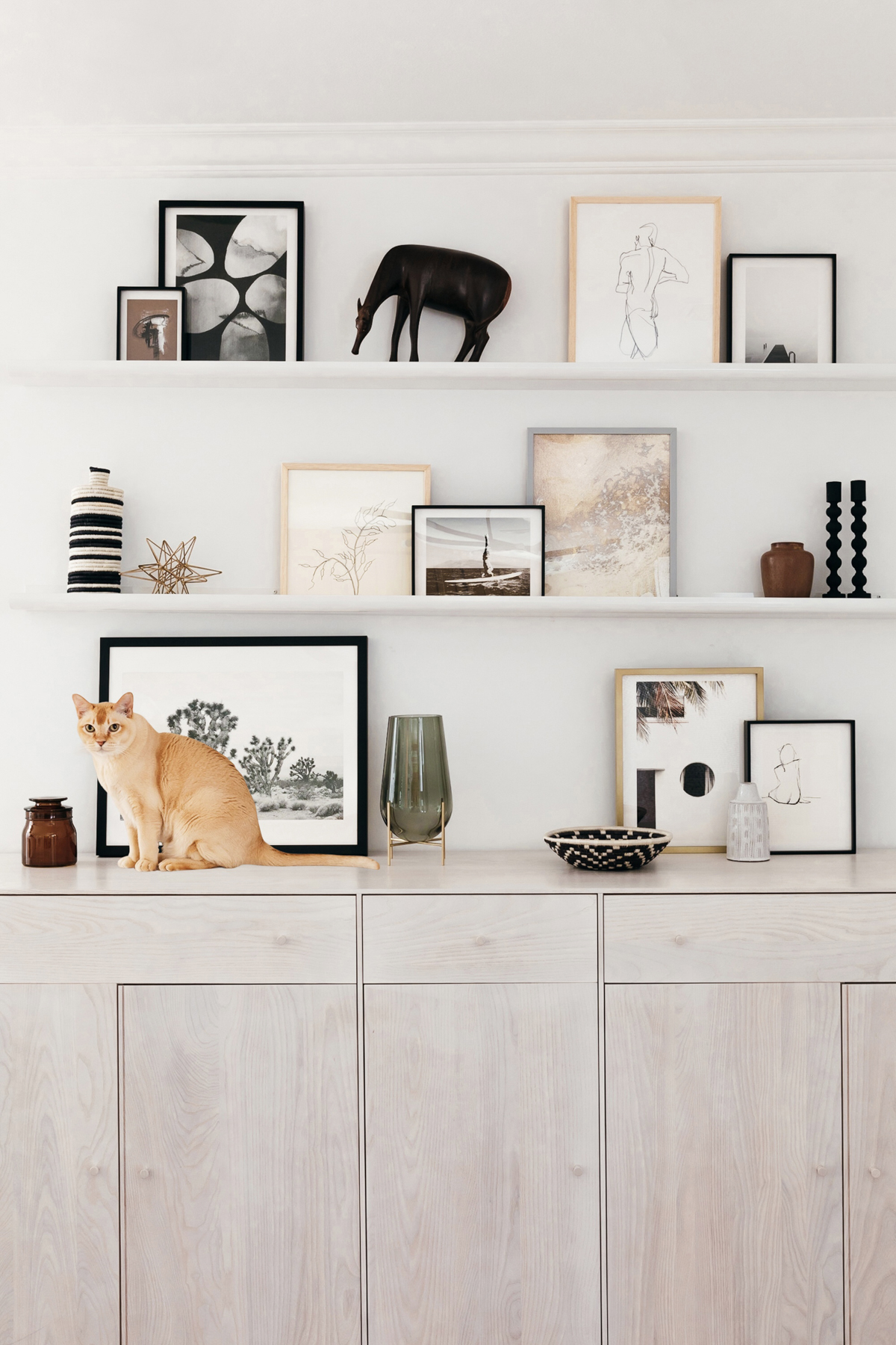
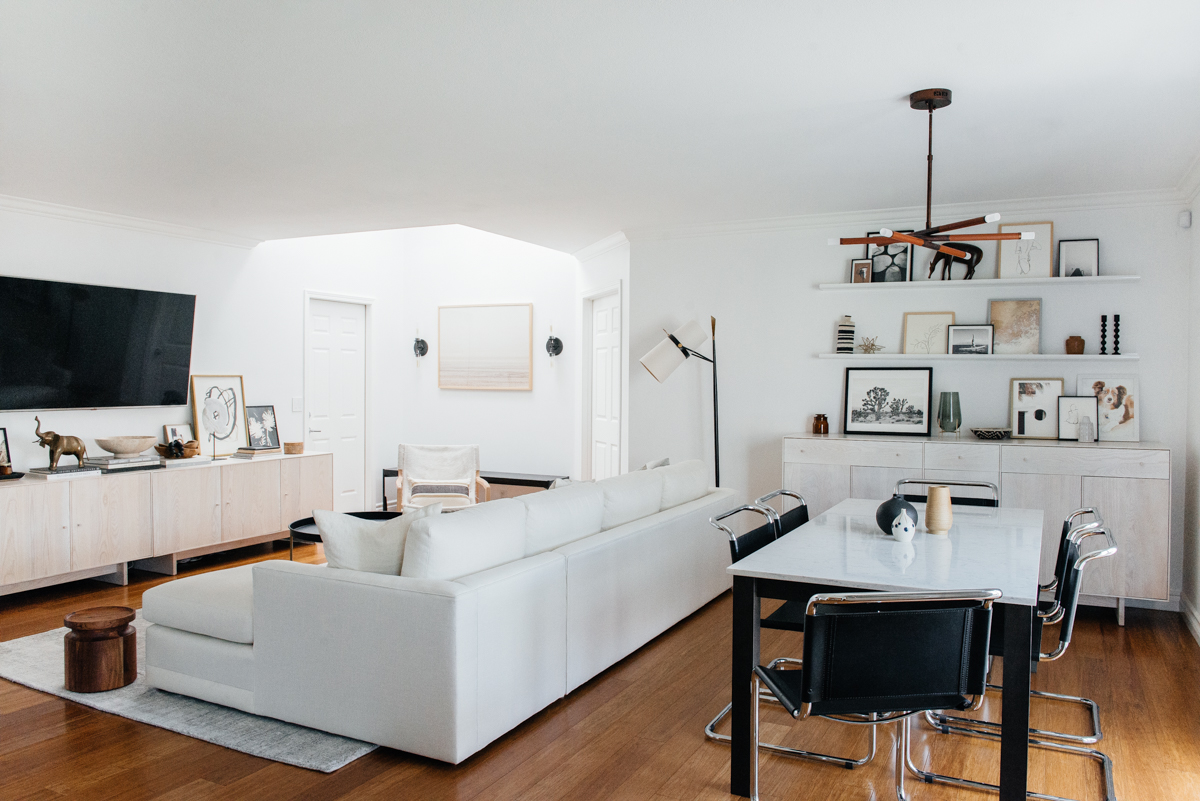
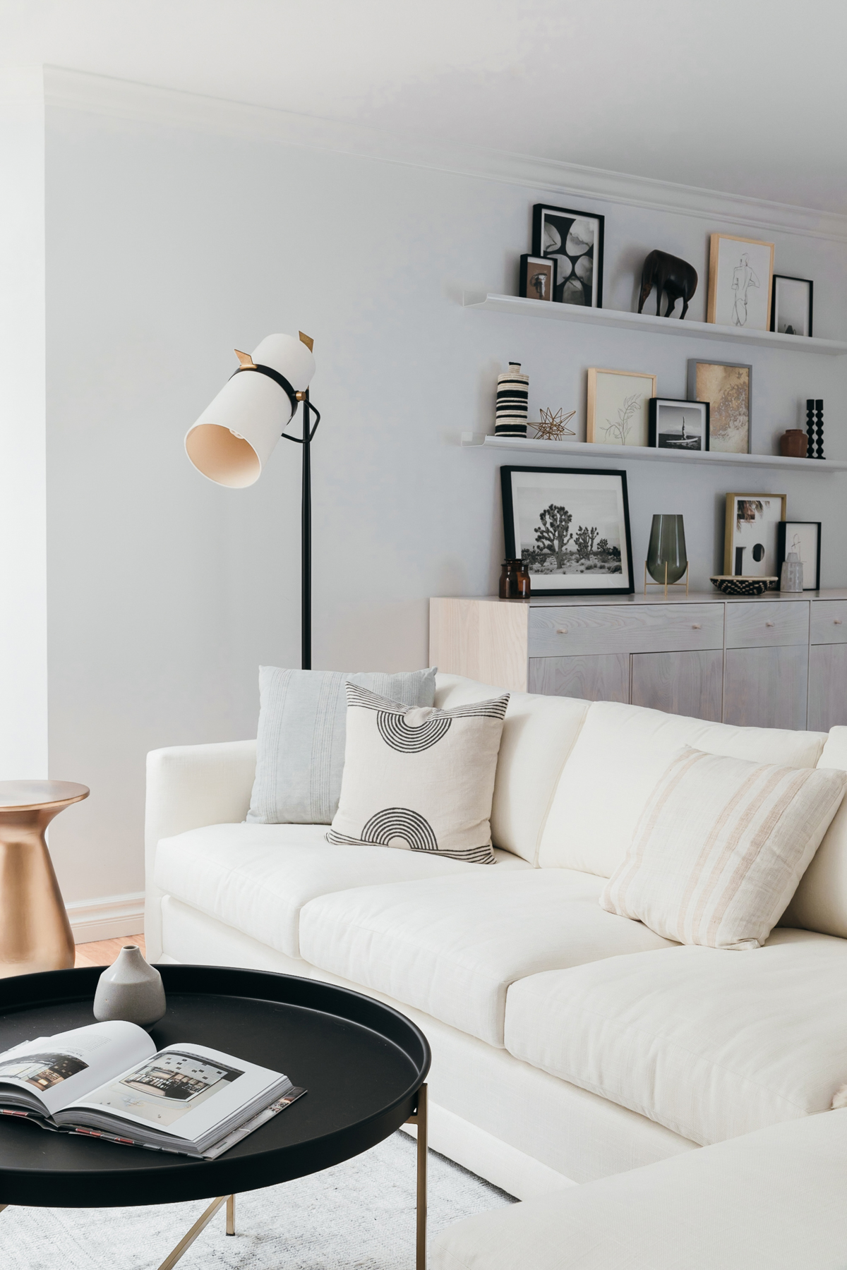
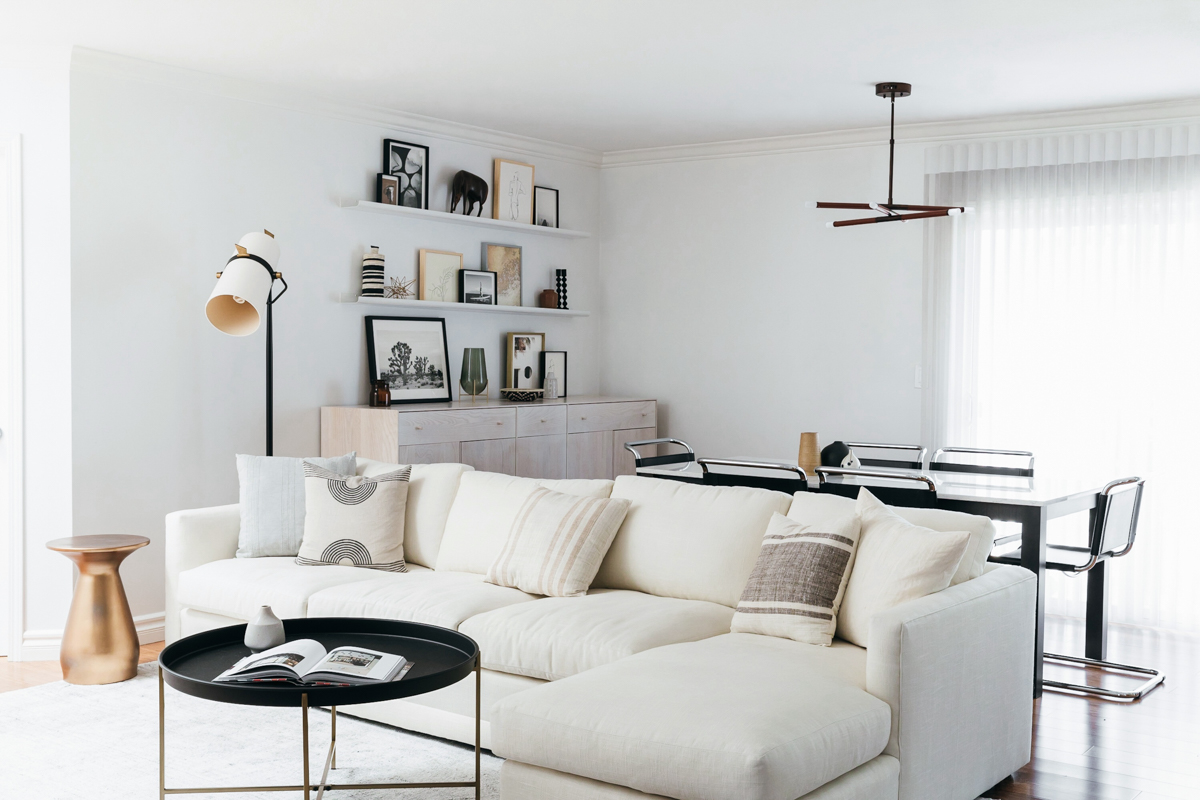
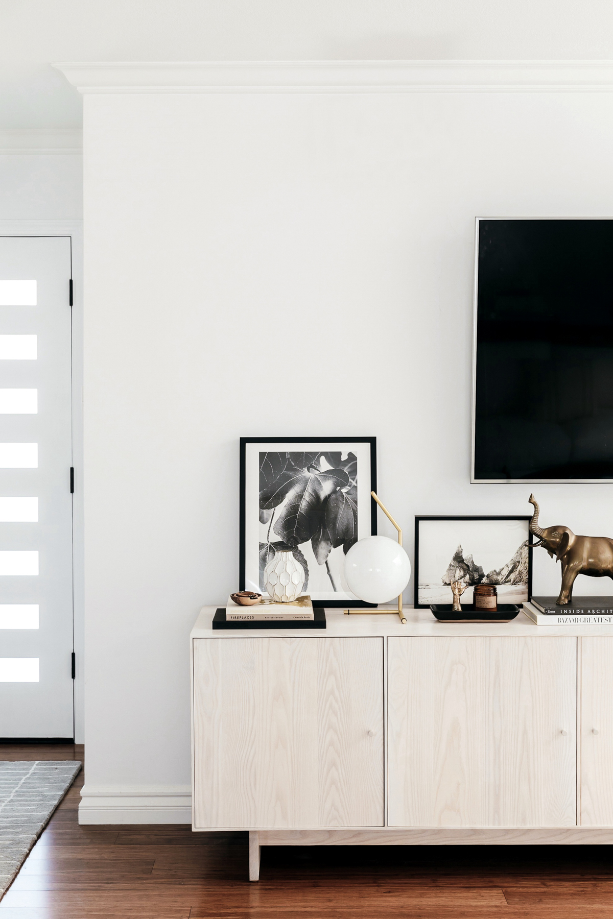
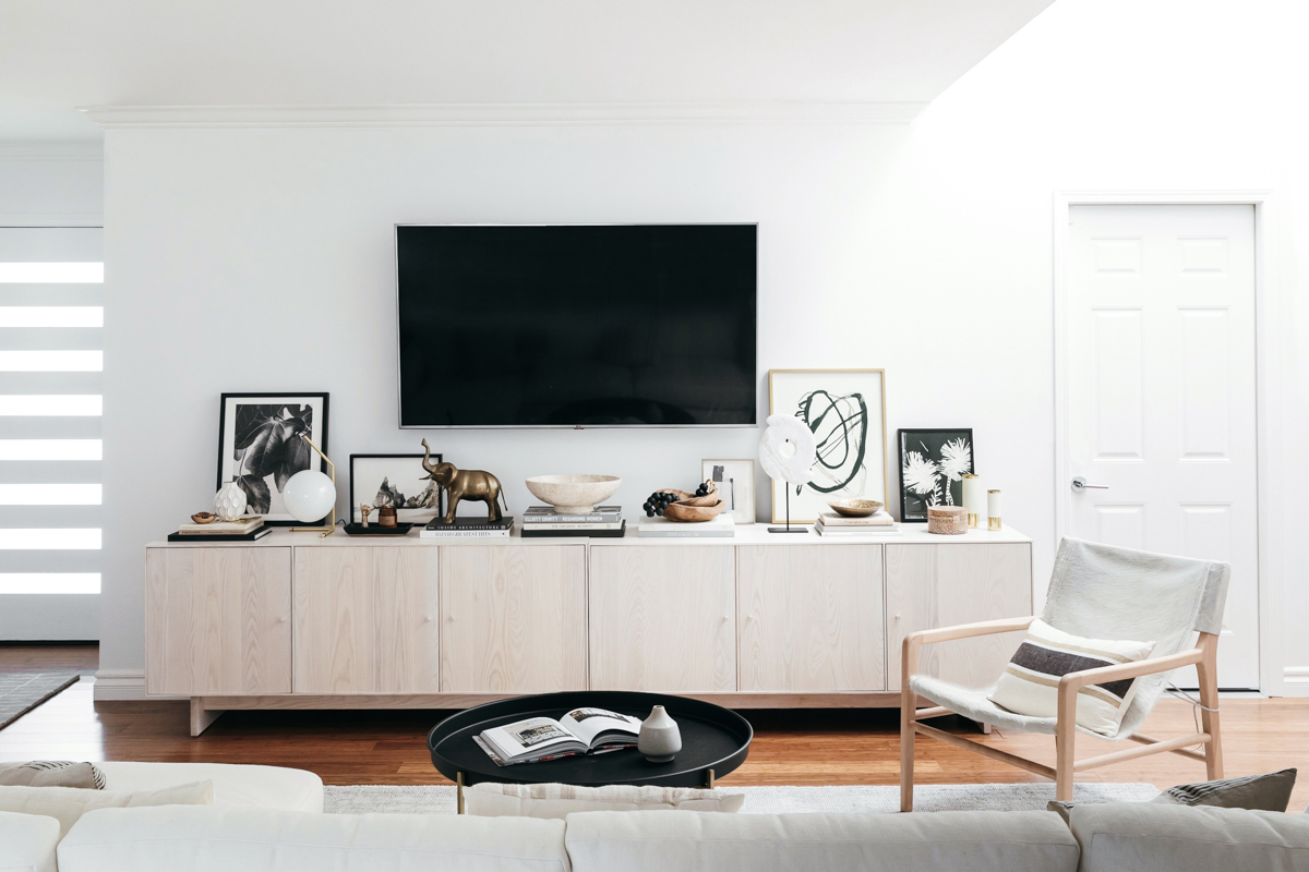
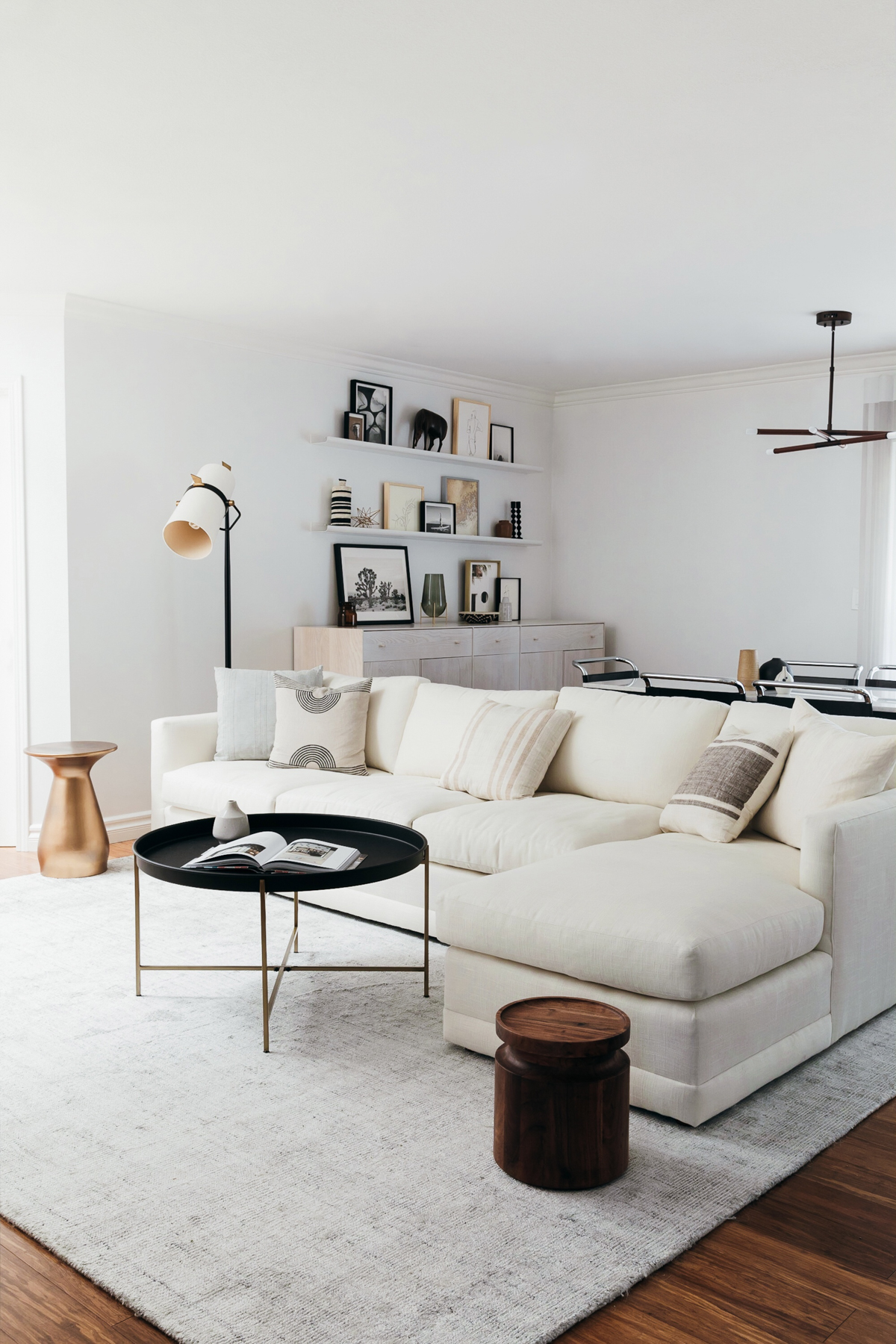
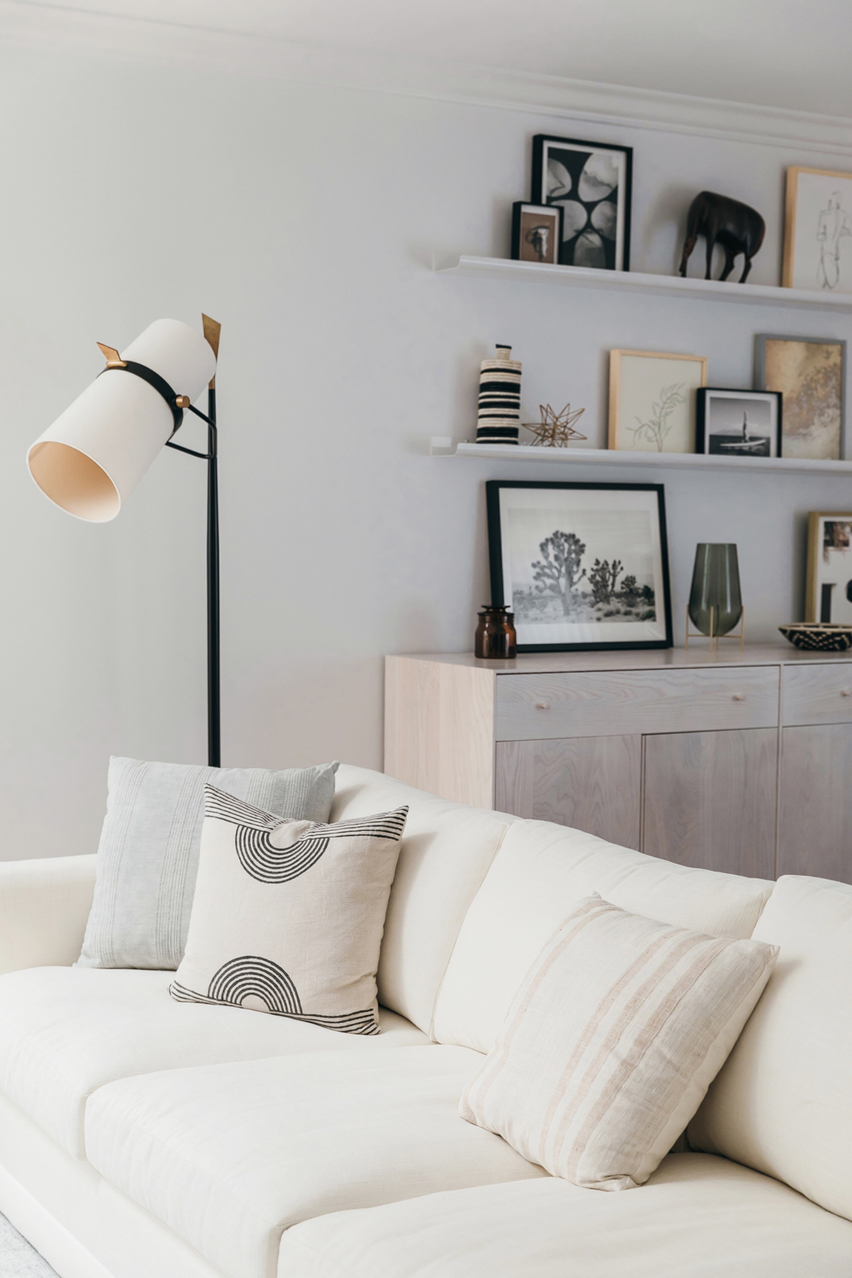
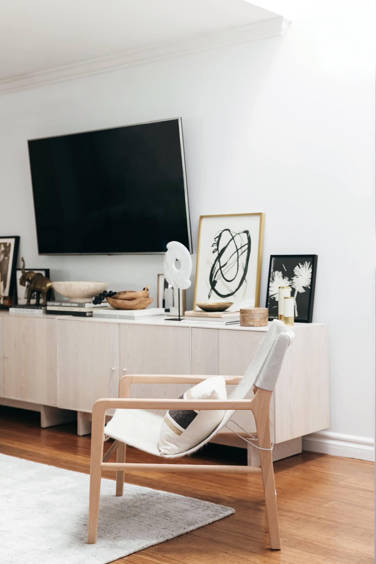
Our living room and dining room are both one open space and with our old furniture, felt a bit cramped. We just didn’t have the right elements to create the perfect open feel. One of my biggest priorities for the space was to not lose any storage that we currently had. Of course we were replacing all cabinets in both the dining room and living room but my biggest concern was making sure we streamlined the space without losing that precious concealed storage. Room and Board ended up being the perfect solution for our storage needs. We chose the Hudson Custom Cabinet system so that we could build out exactly what we needed. Custom sizing for small spaces can be key to maximizing every square inch of your space. For the living room, we wanted to open up the wall with the tv to create more breathing room for art pieces and other decor items. We combined 2 custom storage units to create the illusion of 1 long unit. Anne always knows how to add warmth to a space and she helped to pick out this white washed wood which still feels nice and light and airy. We were able to hide all of our electronics like the cable box etc which leaves the space feeling clean and clutter free. For the dining room, I needed enough storage to stow away all of our dining entertaining pieces and we chose to use the same hudson cabinet system to tie both spaces together. These are some of my favorite pieces in the space and are made so much more special since they are our own custom creations. I would not have been able to get that maximum storage without being able to really fit our space perfectly. Another big important element for our space: the couch. I can not tell you how long it took to find this piece. I originally had a couch in our space that was too large and it really crammed our living room and dining room together. Our goal was to find a slightly smaller couch that still had a chaise. I was very skeptical to buy a couch online without testing it out first but after months of looking for configurations, Anne and I were hitting a wall. We finally discovered Maiden Home. I hadn’t heard of their company until Anne mentioned them to me. What I loved was that they have a collection of a few key pieces that can be custom configured and with a short lead time so you don’t have to wait forever for your custom pieces. The Warren couch checked all the boxes for me: modern, the perfect size, and cozy! My issue with alot of modern couches are that they aren’t lounge worth and for Blake and I both love to lay down and nap on our couch so comfort and design were key. Another key factor for our couch was the fabric. With 2 cats, 1 dog, and 1 newborn baby, I wanted to make sure what we chose was durable. I was very excited that Maiden Home offers Crypton fabrics. If you remember, we chose crypton fabrics for our bedframe and the chair in our bedroom because of their durability and ease to clean. So we lived my dream and picked out the most beautiful white linen fabric. I know, I know, white couch with a newborn? Thank goodness it’s easy to clean. To style the couch, we picked out some gorgeous neutral pillows from The Little Market because I am obsessed with all their products. We also mixed in 2 more graphic pillows from the Block Shop.
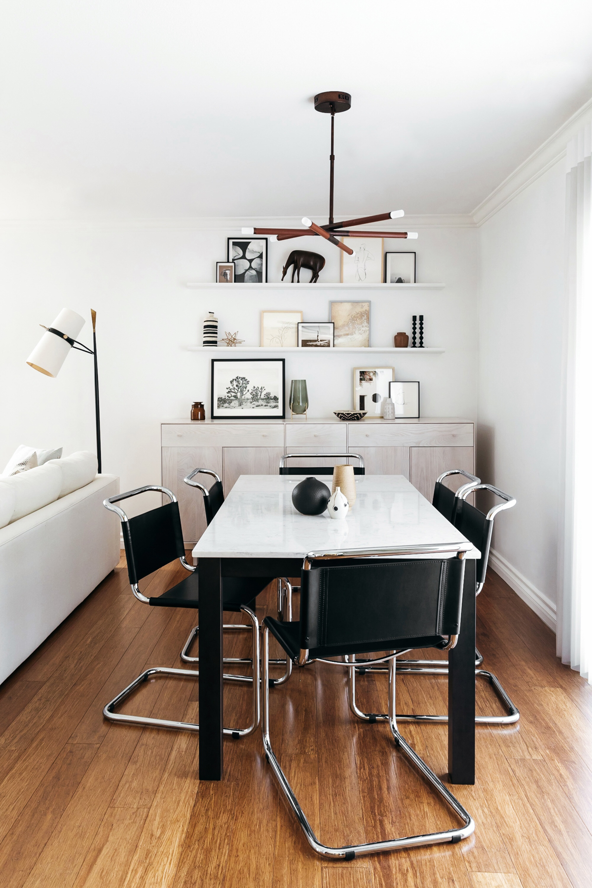
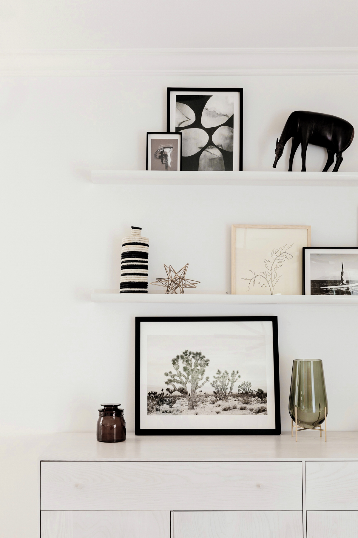
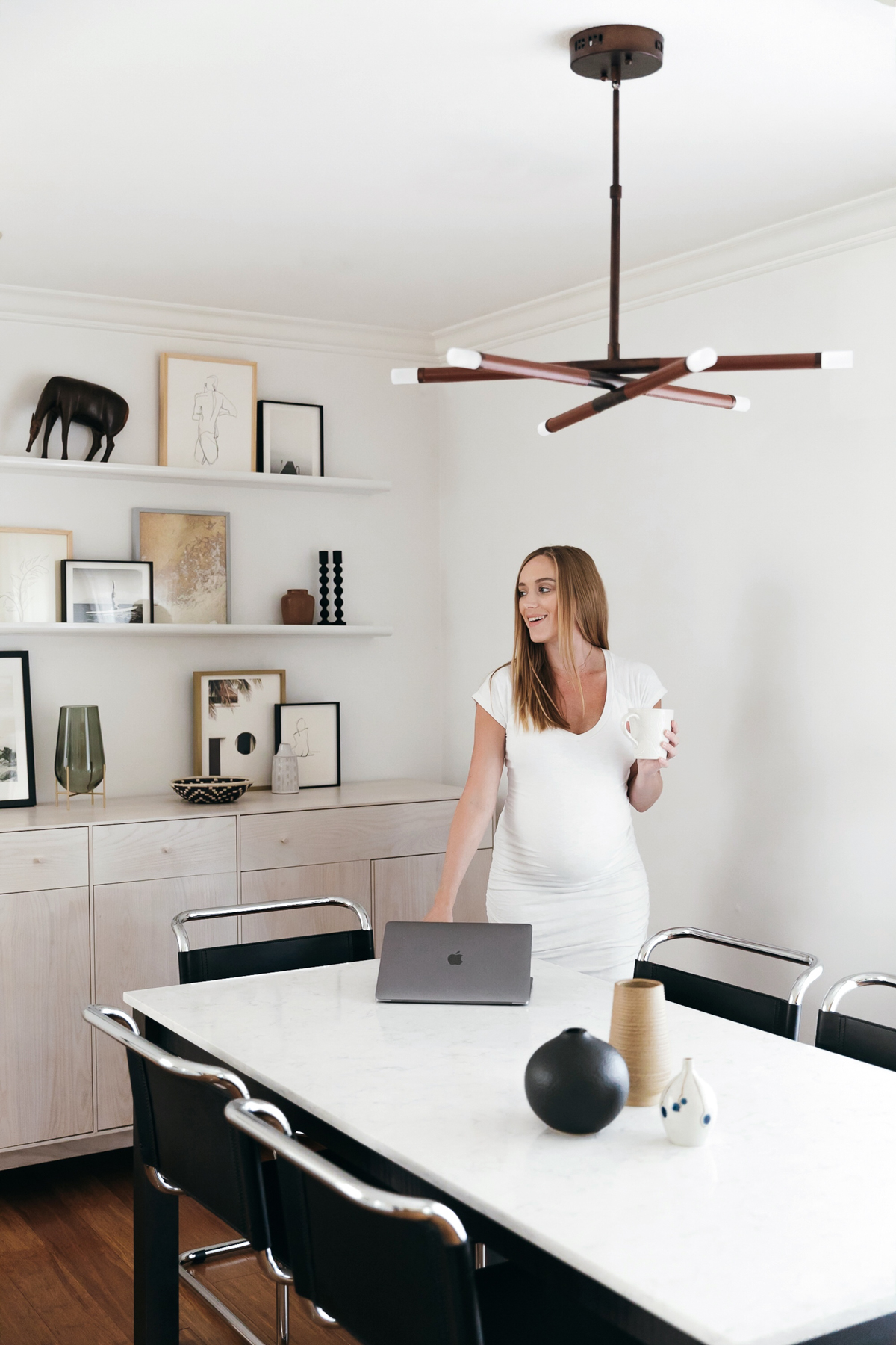
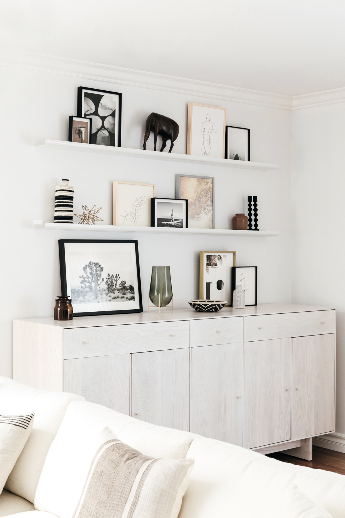
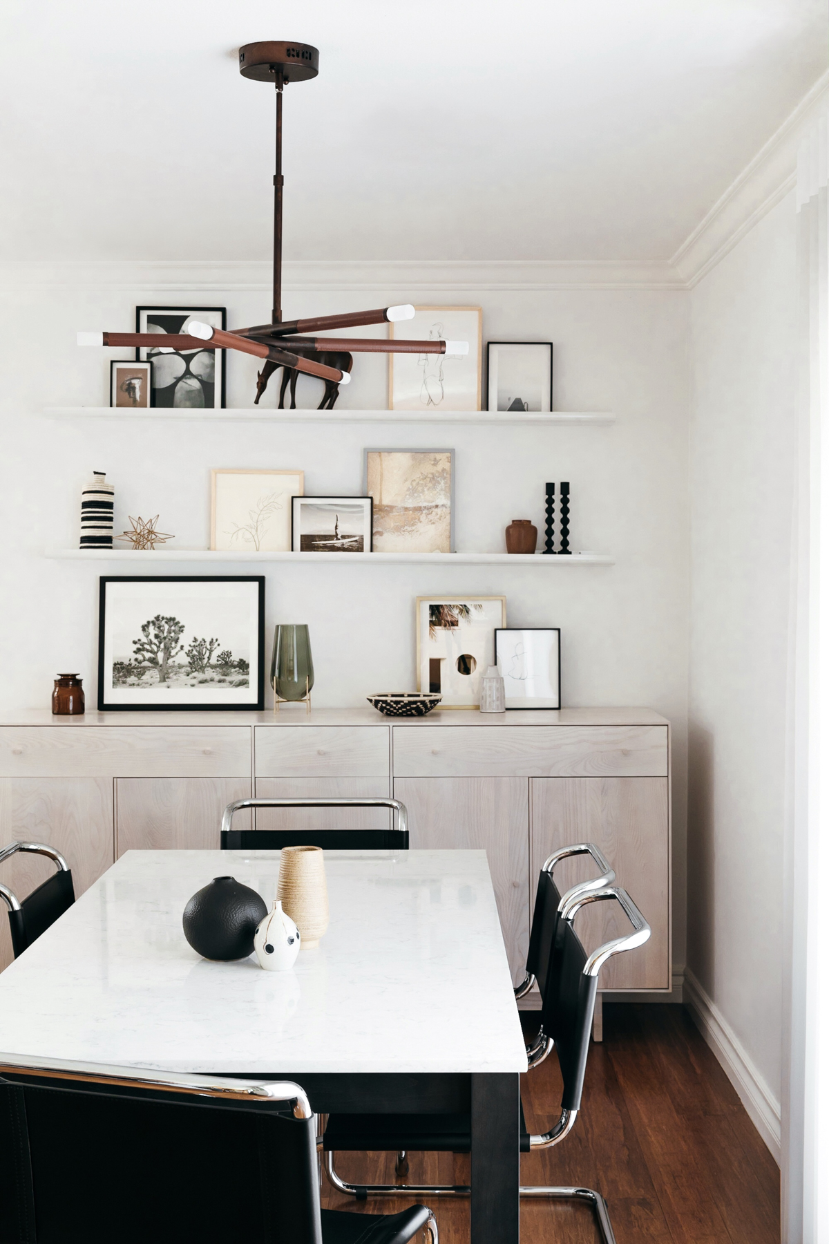
For the dining room, I originally had a small 4 seater table but wanted to larger table with seating for 6. Since we sized down on our couch, we were able to push it forward about a foot leaving more precious space for a new dining table and chairs. We created my dream table, the parsons design from Room and Board. I am a sucker for marble but know that it can be so hard to upkeep and keep stain free since it’s so sensitive to so many things. So I wanted to pick something that had a marble feel but way more durable for long term wear and tear. We chose the marbled white quartz that has a beautiful finish and has been holding up great. To give the dining area some contrast and a modern twist, we picked out these leather sling chairs from Room and Board. They are honestly so comfortable and are super easy to wipe down. My nephews come over all the time and put their sticky food fingers on everything and they have been so easy to clean up after by simply just wiping them down. Another big element for the dining room was the gallery wall. I wanted a place to be able to display some artwork and be able to easily update over time. We went with some long white ledge shelves so it would be easy to lean artwork and change it out on a whim. For the artwork, we picked out all different pieces from Minted. Their selection was huge and it was easy to get different framed and matted styles of pictures to create a great textured gallery wall. To fill the rest of the shelves and top of the storage piece, we combined both vintage and new items to finish off the styling. Anne brought some incredible vintage ceramic pieces and we added some beautiful handmade woven pieces from The Little Market. The last big piece on the table top was a vase from Perigold. Love how the metallic detail works as a sculptural element. Above the dining room table we added wiring for a chandelier. I wanted to do something more modern here and love this chandelier from Craftmade. We also installed a dimmer because I am all about custom lighting options for setting a moody dinner scene.
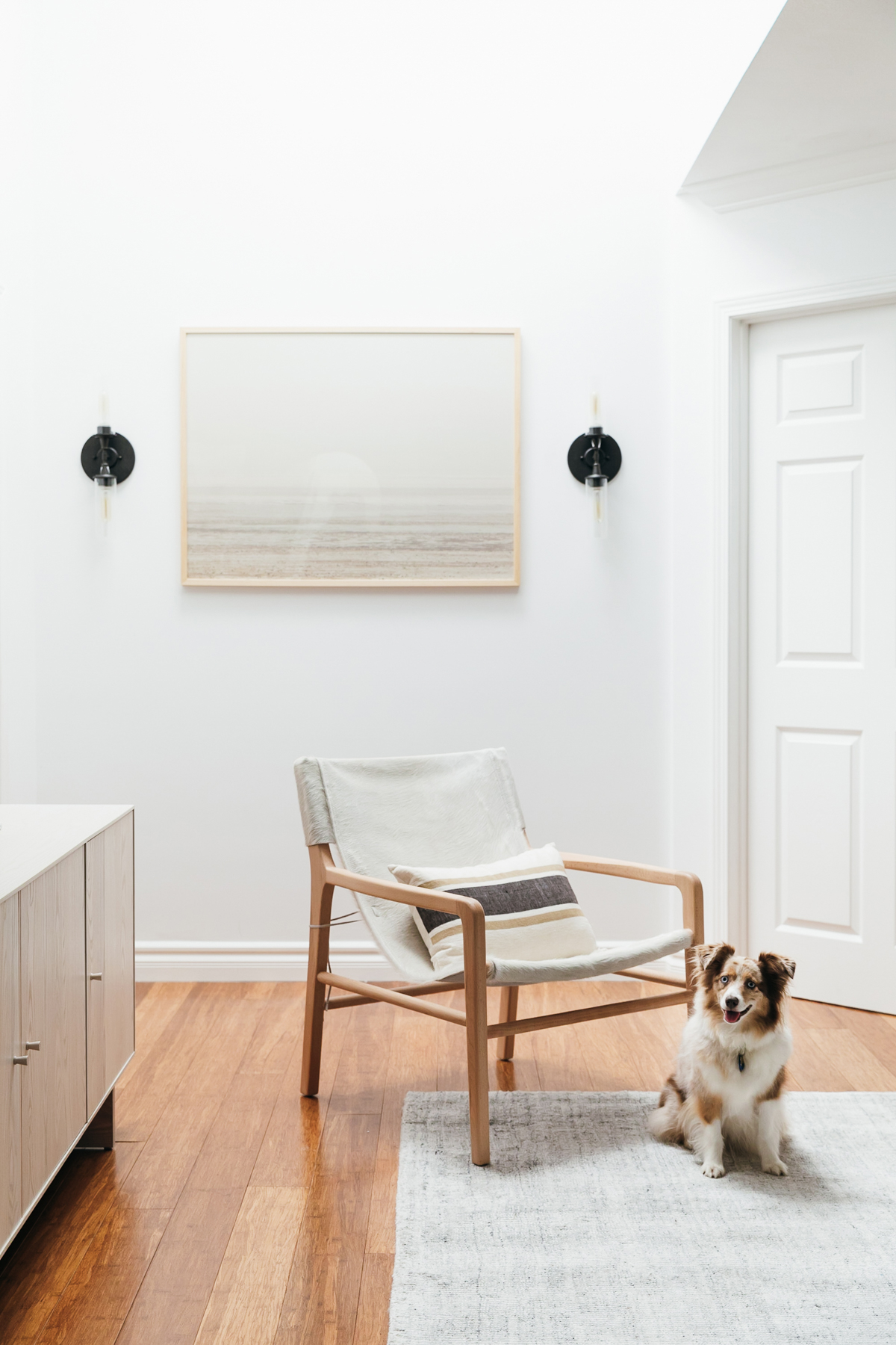
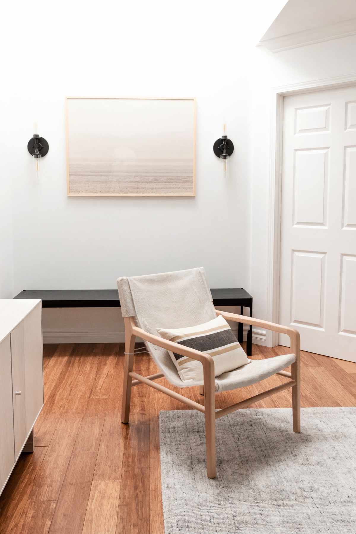
Moving on to the living room, besides the sofa, we needed some other elements to finish off that space. We found these two side tables to place next to the couch. Blake has been hoarding the bronze one to work on his laptop and I have been using the cute little wooden stool to place my morning coffee. We also picked out a statement floor lamp from Perigold which at first I didn’t know if we truly needed but I feel it really ties that corner of the room together. Next up was the coffee table. It was SO hard to find the right height and size we needed. We ended up finding this one at Target and it’s even on sale now! Target has been killing it in the furniture game lately and this was an amazing find. We have so many dark accents thrown into the design mix to balance out all the light neutral tones. We wanted to also add an additional seating option to our living room since we picked a smaller sofa. We picked out this sexy sling chair from Maiden Home which is made of cowhide. I know, another white seating area but cowhide is super durable and easy to clean. It’s so comfortable (even though it doesn’t look it!). I love modern design but if it’s not cozy, no thank you. This chair checks both boxes: sexy and comfy. We styled it with a pillow from Accompany which adds to the cozy factor when sitting in it. To finish off the room we had to pick a rug. While I was obsessed with my old rug, Anne convinced me to open myself up to changing things up and freshening up the space with a new rug. We picked out this neutral option from Jaipur Living which has a great slight texture to it,
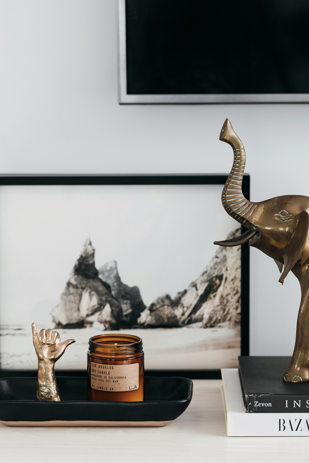
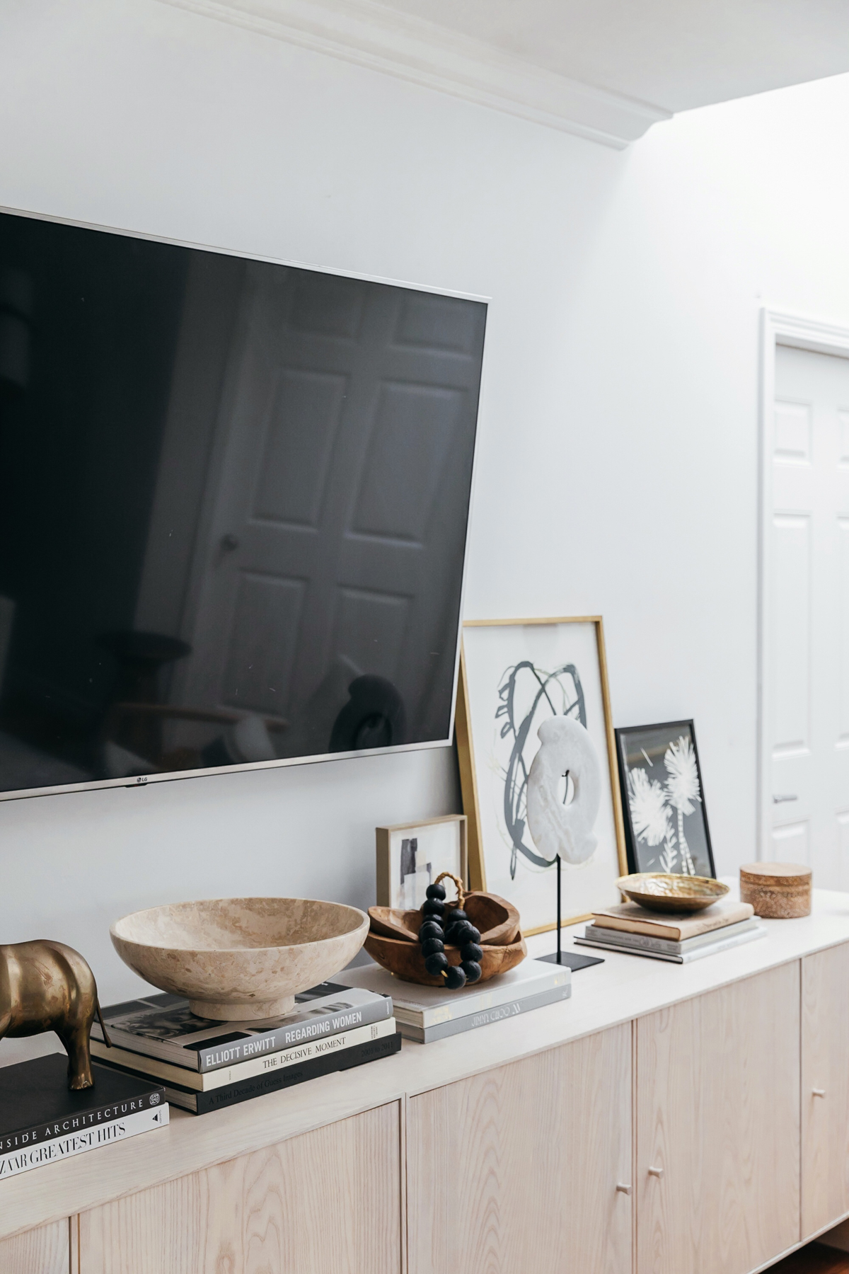
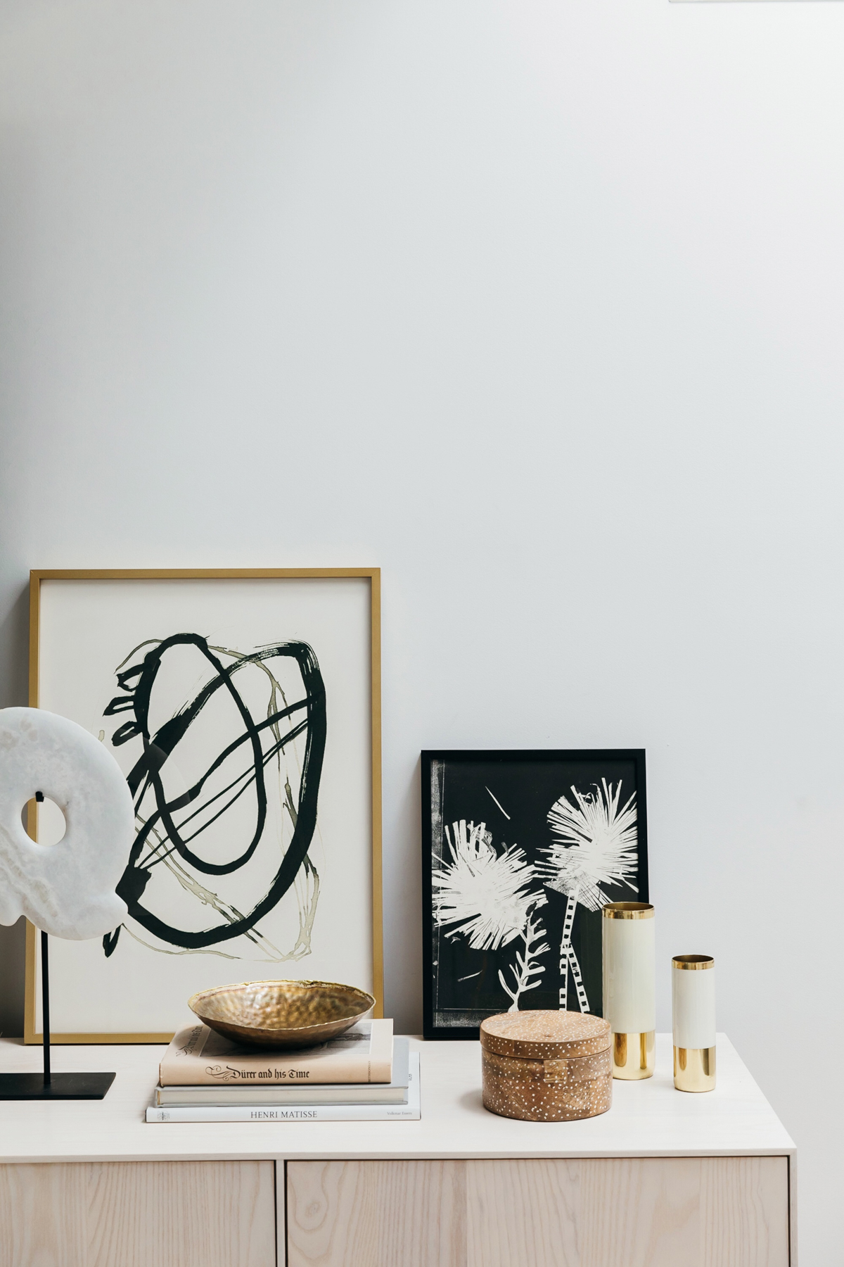
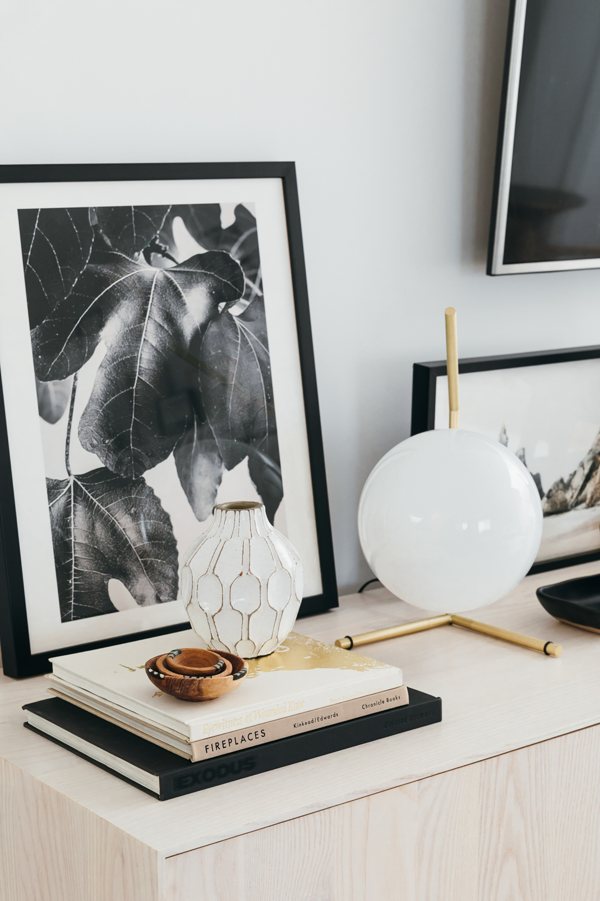
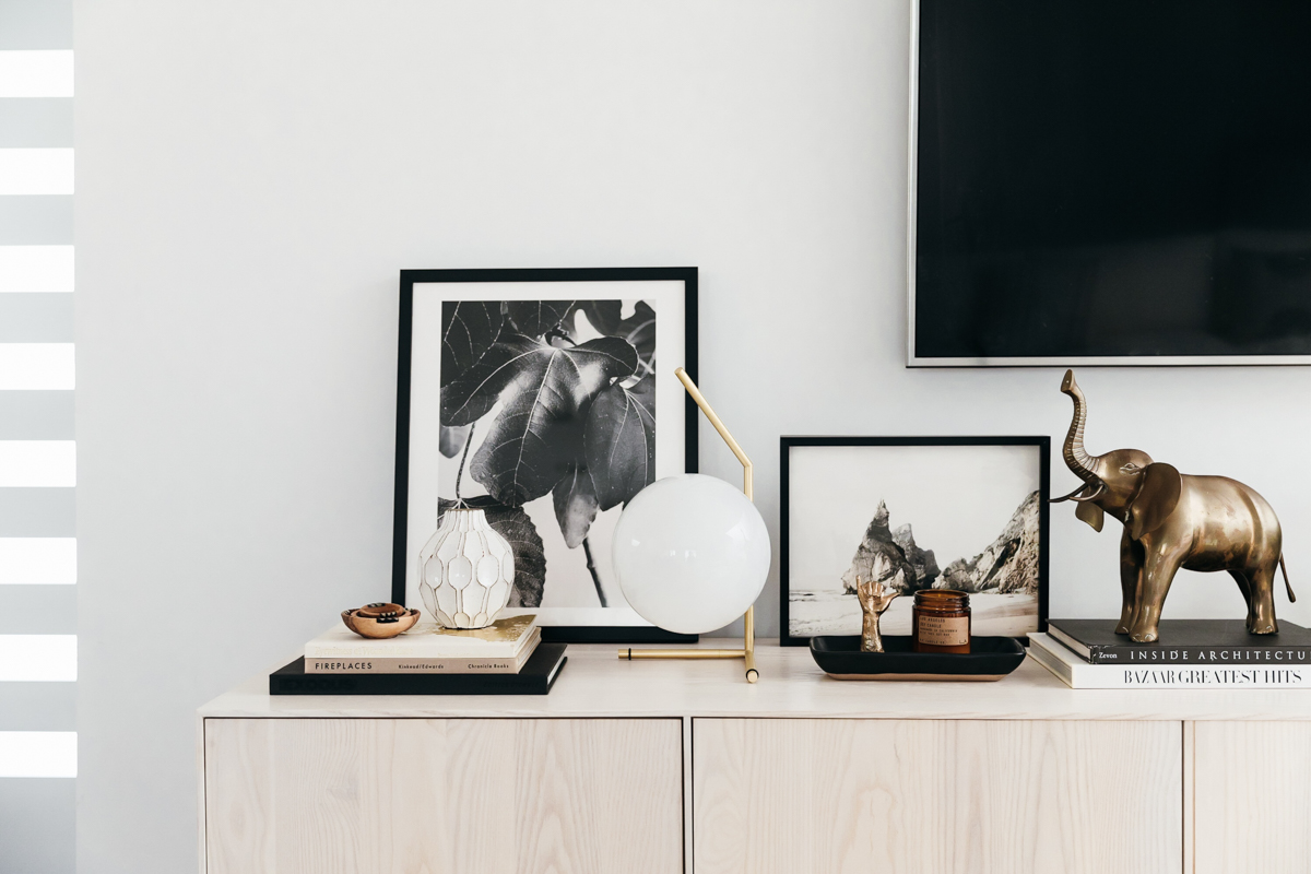
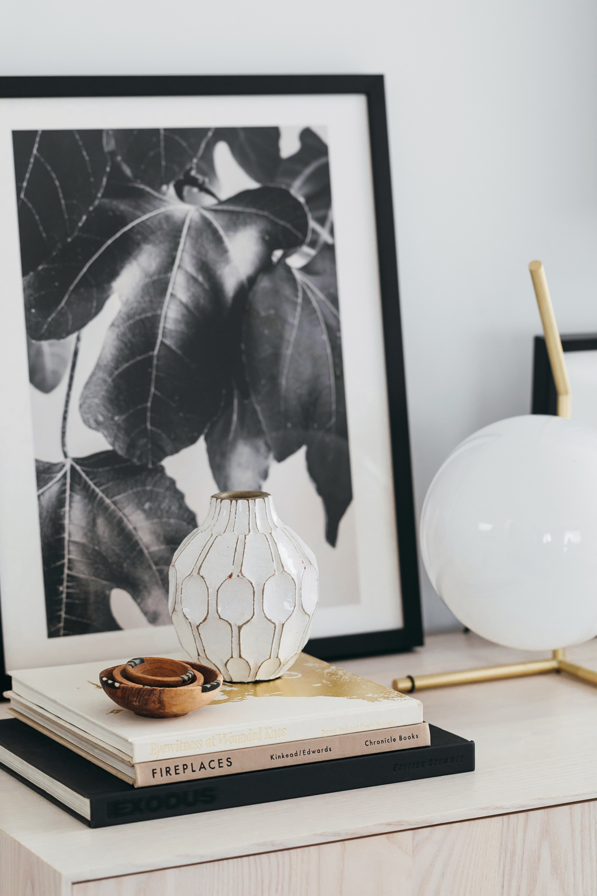
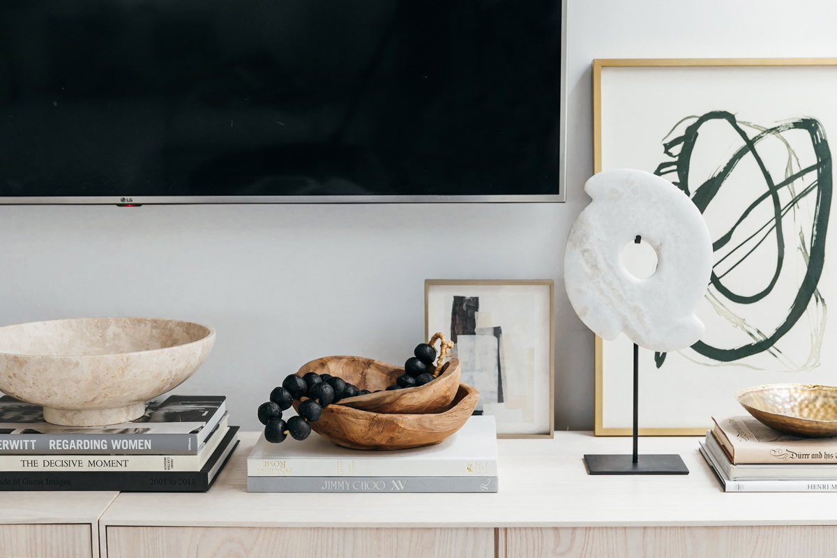
When it came to decorating the top of our media units, this is where I really turn to Anne because she is a styling GENIUS. She first headed to her local used book store for a variety of coffee table books. This is a great tip if you want to stock up on coffee table books but don’t want to spend hundreds of dollars on amazon buying new ones. We added more framed pieces from Minted leaning against the wall in a variety of sizes. One of my favorite pieces here is this wooden bowl set and beads from St. Frank. It was all about little details too like these little nesting bowls from Accompany and this killer table lamp is a favorite from Perigold. We also found these vases from Accompany that added a fun metallic detail to the decor. We also finally mounted out tv on the wall which makes things look so much cleaner.
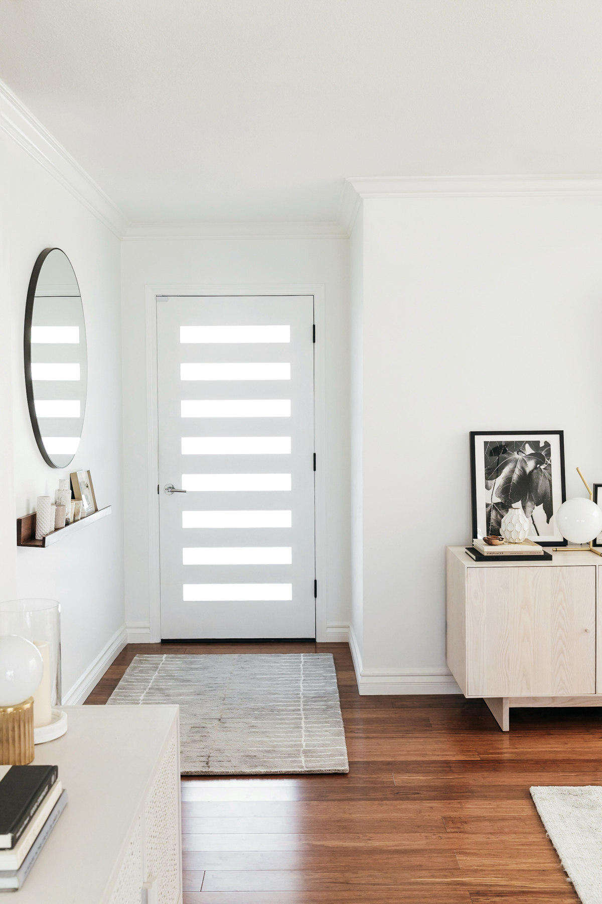
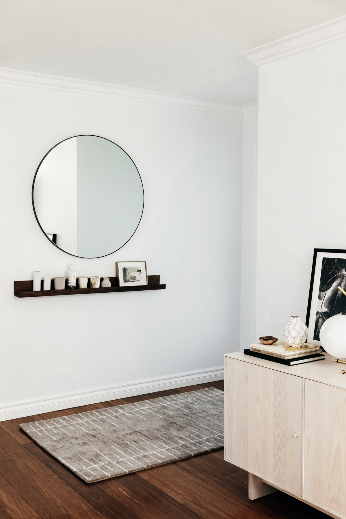
For our front door entryway, I had purchased this round mirror from CB2 months ago in anticipation of using it in our entryway. We picked out this shelf from CB2 as well and styled it with some vintage items and a framed print from Minted. For the rug runner, Anne picked out this one from Jaipur Living that adds a fun print to the space and gives the entry a nice dose of texture for right when you walk in the door.
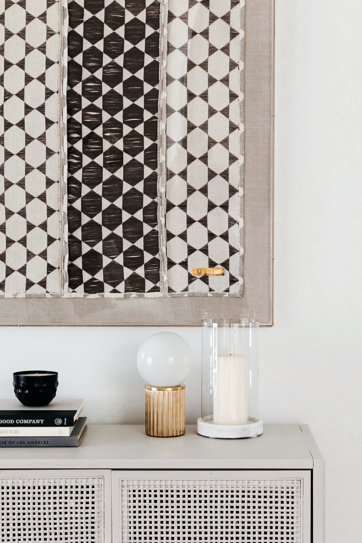
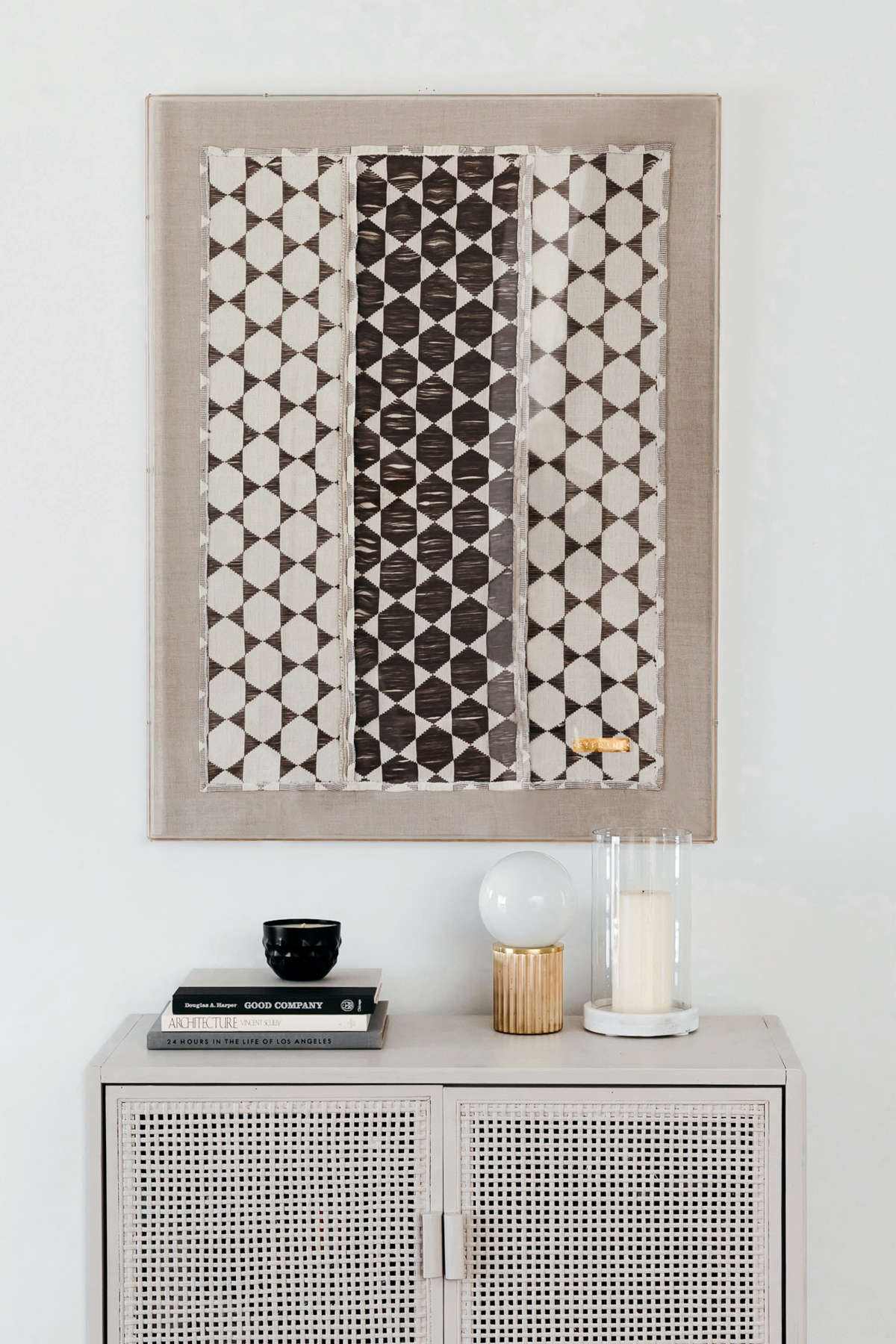
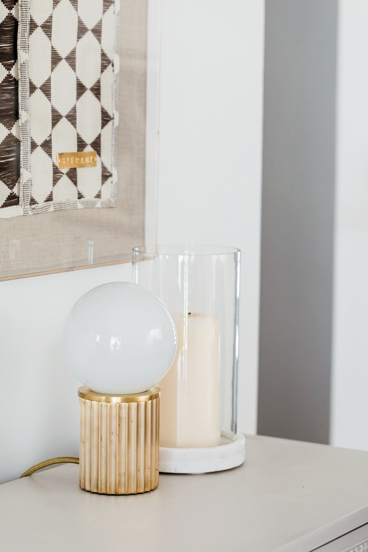
In our bar area, we replaced our open rolling bar cart with this amazing little cabinet from Target. Anne inspired this little diy project since she had recently bought the larger version of this cabinet and decided we need to paint it. Such a fun way to customize this for our design scheme. The little table top lamp from Urban Electric pulls in more of that gold/bronze color we have throughout the space. And then the show stopping framed textile from St. Frank finishing off this little corner.
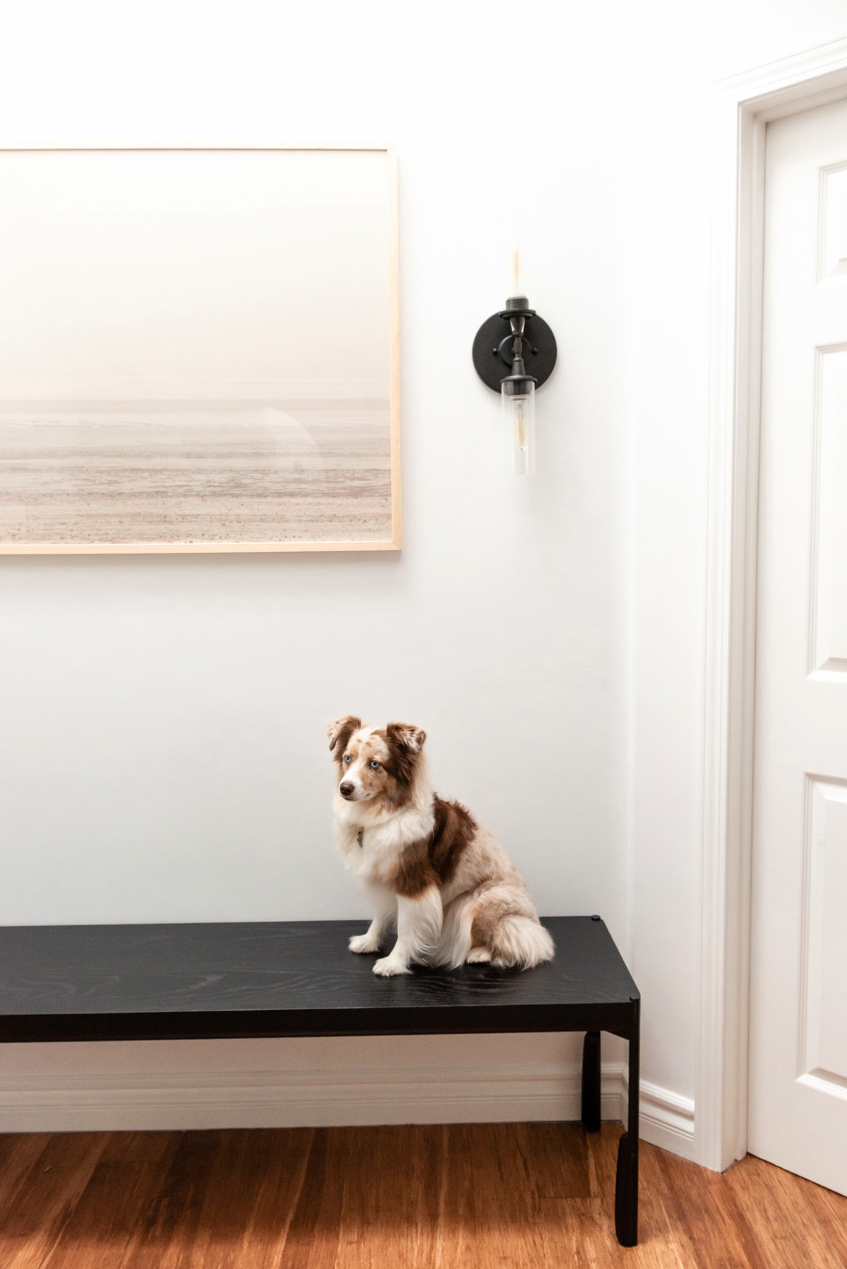
The last area of the living room is the garage entryway. We knew we wanted to incorporate a large piece of artwork and rework my existing single sconce. We picked out a big framed photo from Minted and flanked it with 2 modern sconces from Craftmade. To finish off that area we have this custom sized wooden bench from Skram Furniture which was perfect since we needed something to fit the space perfectly.
Now that the space is finished, I just can’t wait to get cozy on the couch or even just enjoy dinner with Blake at home. Never underestimate the power of a good decor facelift to really change the way you use and feel in your home. It has the power to change your mood and can add so much more comfort to your home. Anne is a genius and I always love how we bring our combined vision to life. Next up, the nursery! We are also so excited to have the space featured over on MyDomaine here. You can read more about our design vision and how the space came to life.
Entryway 1
Mirror: CB2 / shelf: CB2 / art: minted / rug: jaipur living
Entryway 2
Bench: skram furniture / art: minted / sconces: craftmade
Living Room
Couch: maiden home / Rug: jaipur living / end tables: perigold / coffee table: target / pillows: the little market, block shop, IKEA / arm chair: maiden home / arm chair pillow: accompany / floor lamp: perigold / Media units: Room and Board / lamp: perigold / small wooden bowls + vases: accompany / large wooden bowls + beads: st. frank / artwork: minted
Dining Room
Cabinet: room and board / artwork: minted / shelves: room and board / woven decor: the little market / vase: perigold / chandelier: craftmade / table: room and board / chairs: room and board
Bar Area
Cabinet: target / lamp: urban electric / artwork: st. frank
photos by Monica Wang
The post OUR HOME // LIVING ROOM + DINING ROOM appeared first on eat.sleep.wear. - Fashion & Lifestyle Blog by Kimberly Pesch.
Via RSSMix.com Mix ID 8246157 http://www.rssmix.com/
Comments
Post a Comment